IG Internal Platform
Redesigning a complex internal operations platform to make financial and customer-support workflows clearer, more efficient and easier to manage.
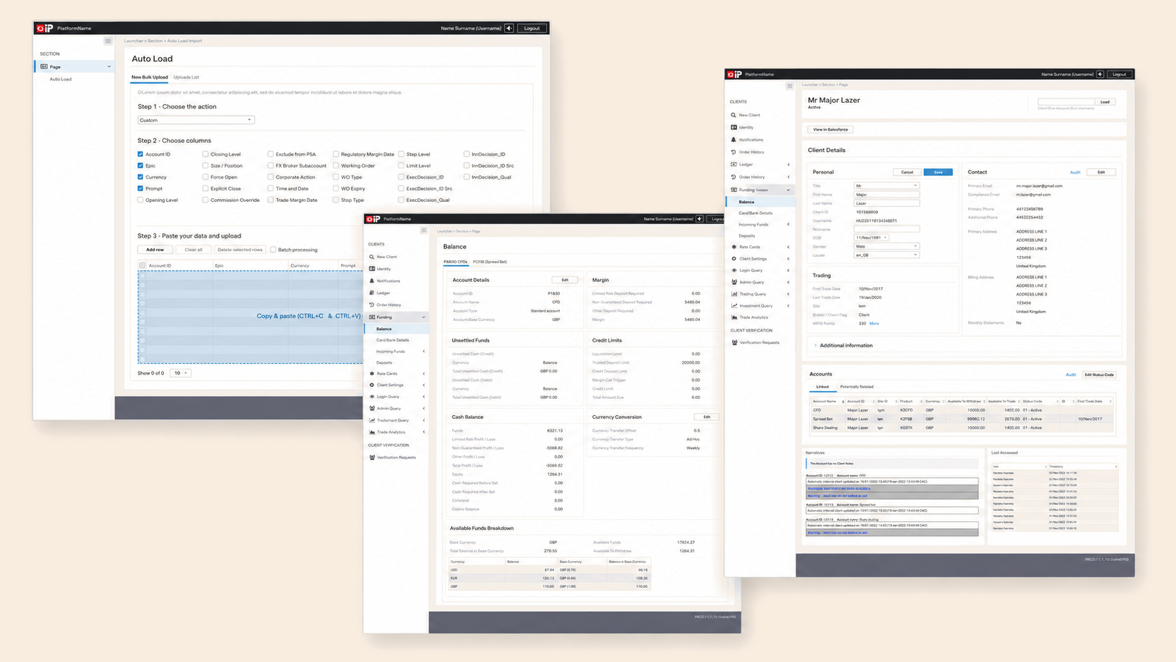
Specific designs, client data and internal materials are illustrative or anonymised and cannot be shared publicly. This case study describes the design process, decisions and challenges using non-sensitive materials only.
Making a complex operational
environment easier to understand
IG Internal Platform is a browser-based application used by internal teams to manage and support customers using financial products offered by IG.
The platform brings together multiple operational, financial and customer-management processes that had previously existed across different sources. Different departments needed access to different information and functionality while still working within one connected system.
The project involved migrating an existing internal platform to a new browser-based application and designing flows for new functionality.
The challenge was not simply to modernise the interface. The goal was to make a complex operational environment easier to understand and use without removing the depth required by specialist teams.
Understanding the
legacy system
The existing platform already supported users' daily responsibilities, but some workflows created friction, confusion and unnecessary effort. At the same time, users had developed habits and workarounds around the legacy system.
Before proposing changes, I needed to understand:
- Which parts of the existing platform were still useful
- Which patterns users relied on
- Where the current experience made their work harder
- Which behaviours existed mainly because of historical or technical constraints
The goal was to preserve useful workflow knowledge without simply recreating the legacy interface in a new visual style.
Understanding real
operational workflows
My research began with two fundamental steps: understanding the existing platform, and speaking with and observing its users.
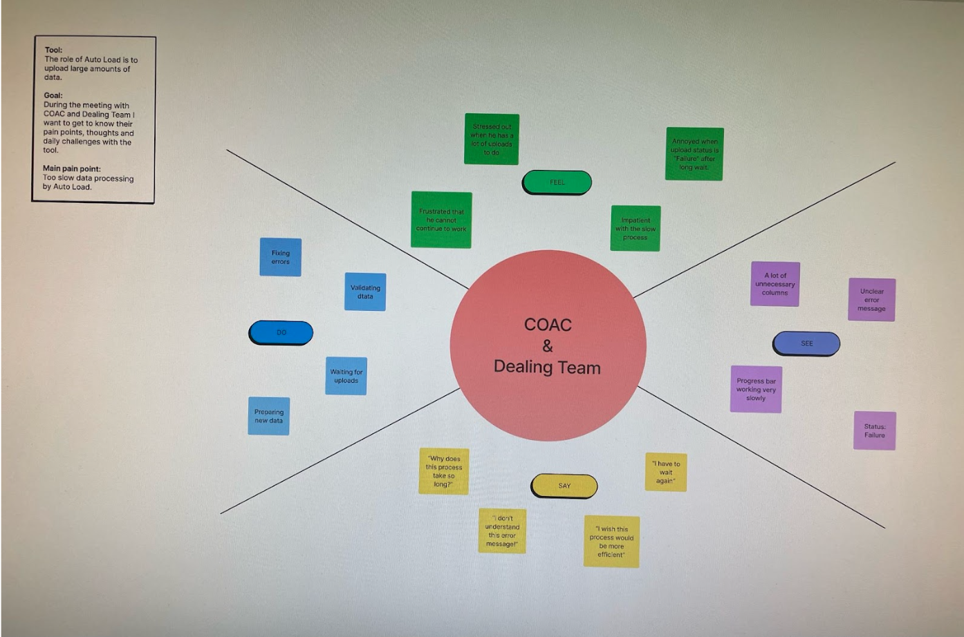
I used focus groups to explore users' pain points, expectations and concerns about the new tool. I complemented these conversations with observation of users performing their daily tasks.
This helped reveal problems that users did not always describe directly. Some friction only became visible when observing how they moved between processes, interpreted information and worked around limitations in the existing system.
Turning research into
product problems
The next stage focused on organising the findings and defining the problems the new platform needed to address.
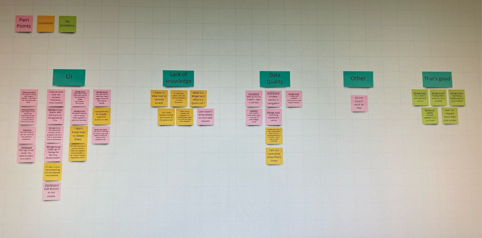
I used affinity mapping to group related observations, identify recurring pain points and distinguish individual preferences from broader workflow problems. At the same time, I worked with business stakeholders to confirm requirements and define the scope of work.
The synthesis process surfaced additional dependencies and questions. Understanding the interface alone was not enough. I also needed to understand the financial, operational and trading processes behind it. That domain knowledge became an important design input because many interface decisions depended on:
- How actions were connected
- What information users needed at different stages
- What consequences could follow from incomplete or incorrect actions
Designing beyond familiar
legacy patterns
One of the challenges of redesigning an established internal tool was that users naturally described their expectations through the system they already knew.
When asked what they wanted from the new platform, they often proposed recreating familiar patterns from the legacy application. Those patterns felt safe because they were known, but copying them directly would also preserve many of the problems the migration was intended to solve.
Instead, I tried to understand what users were actually trying to protect:
- Speed in frequently repeated tasks
- Access to specialist information
- Predictable behaviour
- Confidence that important actions had been completed correctly
Together with developers, I explored alternative solutions during brainstorming sessions. The strongest concepts were then evaluated through rapid concept testing with future users. This allowed us to preserve valuable familiarity while challenging patterns that existed mainly because of the limitations of the old platform.
Prototyping as a shared
decision-making tool
I translated the strongest concepts into interactive, high-fidelity prototypes that could be reviewed by users, business stakeholders and developers.
The prototypes made proposed workflows tangible. Instead of discussing static screens or abstract requirements, stakeholders could move through the experience, ask questions and identify missing states or dependencies.
Clickable prototypes were also used during usability testing to evaluate whether the proposed information architecture and interactions were understandable. The work was iterative. Feedback from users and stakeholders informed subsequent versions and allowed us to identify problems before implementation.
Prototyping also improved collaboration with engineering. Developers could see:
- How components were expected to behave
- How screens connected
- What should happen across interaction states
This reduced the amount of behaviour that had to be inferred from static design files.
Key product decisions
Preserve familiarity without copying the legacy interface
Users' familiarity with the old platform represented valuable workflow knowledge, but not every existing pattern deserved to be reproduced. The redesign focused on understanding why users relied on particular behaviours and preserving the underlying need rather than automatically copying the interaction.
Organise functionality around departmental needs
The platform combined processes used by different internal teams. Dividing the experience into applications aligned with specific areas of responsibility made it possible to adapt functionality to each department while maintaining a shared platform foundation.
Validate workflows before polishing the interface
The product contained many connected actions and edge cases. Rapid concept testing and interactive prototypes helped evaluate workflows and information architecture before investing in final interface details.
Involve developers during exploration, not only handoff
Technical understanding influenced the design throughout the project. Brainstorming together helped identify feasible directions, while interactive prototypes created a shared reference for implementation. Engineering collaboration was therefore part of shaping the solution rather than only a final handoff stage.
Selected interface concepts
The following screens come from the high-fidelity prototype created for the new browser-based platform.
Editing workflow
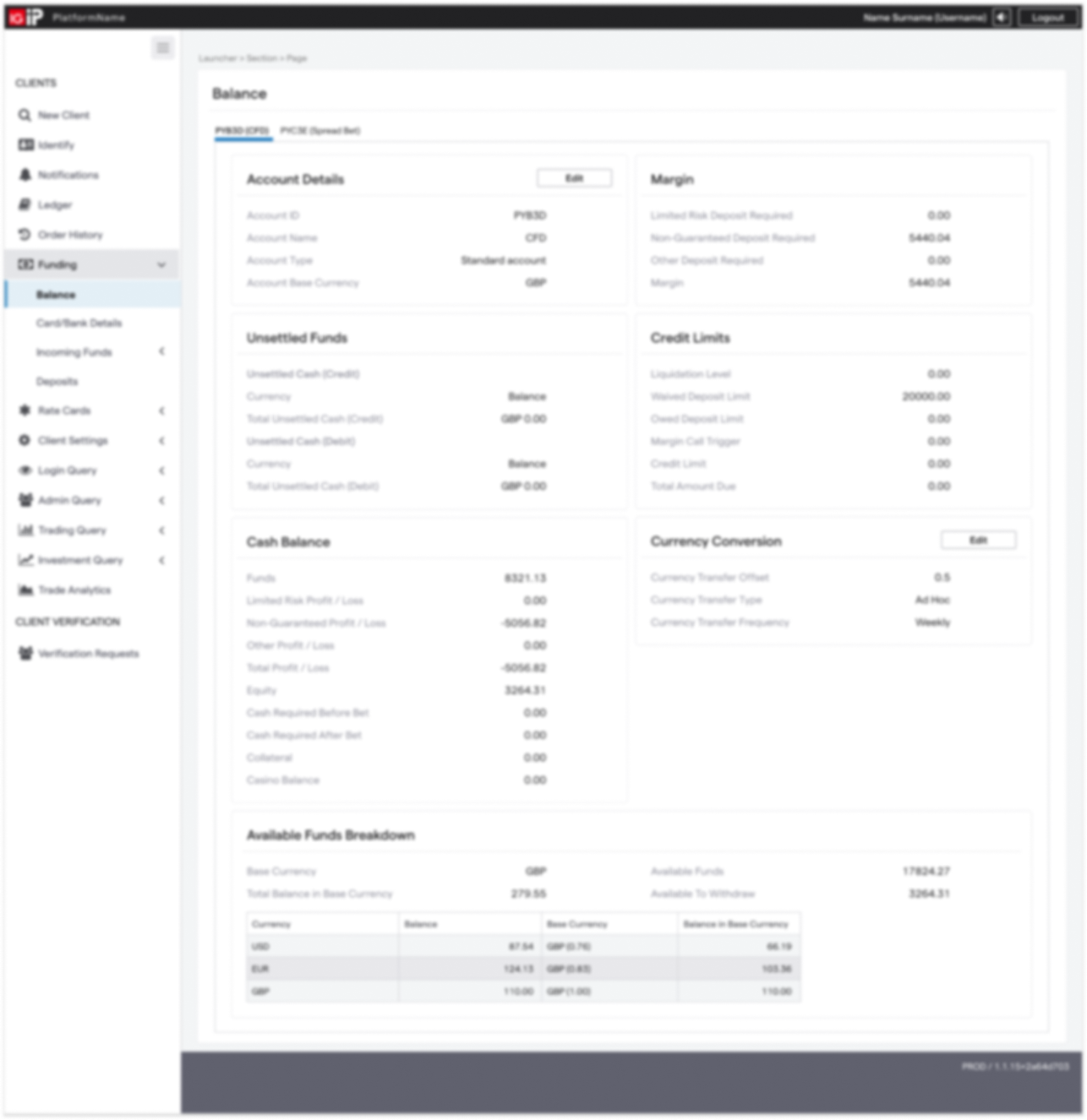
Balance view
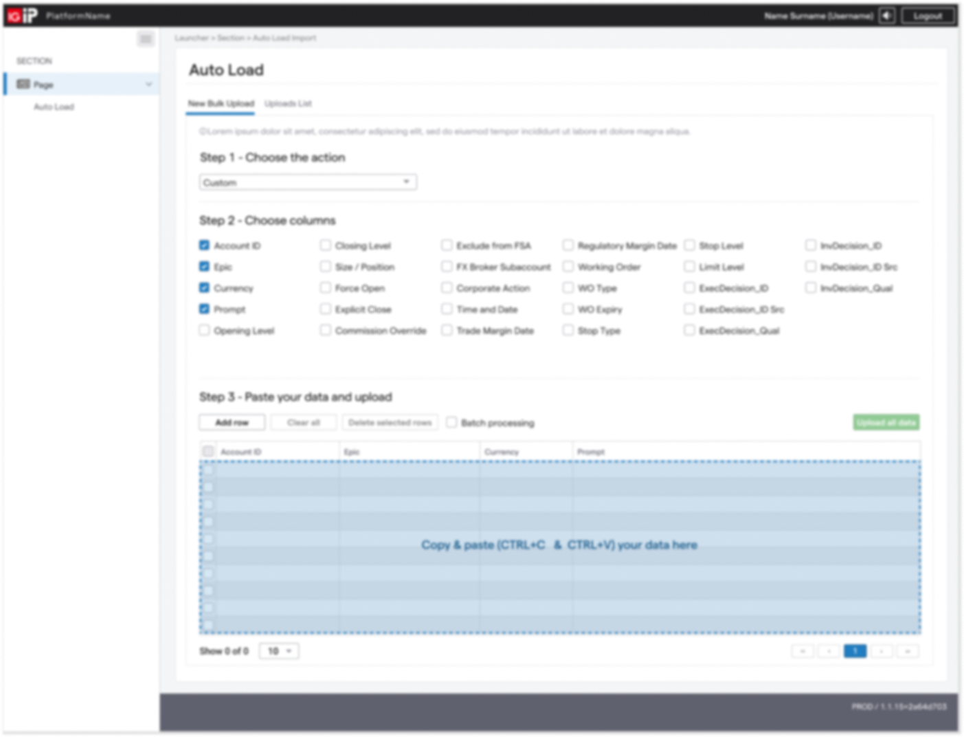
AutoLoad workflow
Outcome
The documented output of this project was:
- Redesigned flows for the new browser-based internal platform
- Concepts for new functionality
- Interactive high-fidelity prototypes
- Concepts validated with users
- Clearer documentation of intended interactions for development
Learning the domain
before simplifying it
The biggest challenge in this project was understanding the users and the domain behind their work.
Finance and trading involve sensitive processes, connected actions and a large number of edge cases. Designing effectively in that environment required more than improving individual screens. It required understanding how decisions, information and system states affected one another across an entire workflow.
The project strengthened my habit of validating solutions early and repeatedly, particularly when a seemingly small change could affect several connected processes.
It also changed the way I collaborate with developers. Working closely together allowed us to combine product, design and technical knowledge, identify risks earlier and create solutions grounded in implementation reality.
The experience reinforced a principle that continues to shape my work: complex products cannot be simplified responsibly until the system behind them is properly understood.