IG Investments
Launching a new mobile investment product for the French market — inside one of the world's leading fintech platforms.
Specific designs and internal research materials are confidential and cannot be shared publicly. This case study describes the design process, decisions and challenges using publicly available materials only.
Designing for confidence,
not just transactions
Investing is inherently uncertain. The challenge was not simply enabling transactions, but helping users understand opportunities, evaluate risks and make informed decisions with confidence.
Users needed enough information to understand opportunities, compare options and feel in control of their decisions — while the product operated within strict regulatory boundaries. Every design decision sat at the intersection of usability, compliance and trust.
Building a new
investment product
Investments was not a redesign.
It was an entirely new product introduced within IG's established ecosystem — built for a market that didn't yet have access to an IG investment experience. The challenge was establishing investment journeys from the ground up: defining how users discover financial instruments, evaluate opportunities, place orders and manage portfolios — all within a highly regulated environment that demanded close collaboration with compliance, legal and localisation teams from the start.
Rather than adapting existing patterns, the work involved creating new interaction models, reusable component foundations and scalable experience frameworks capable of growing alongside the product.
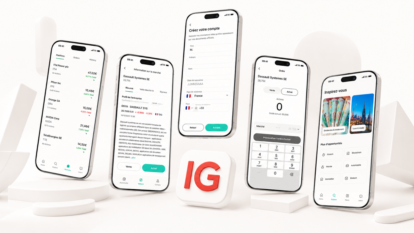
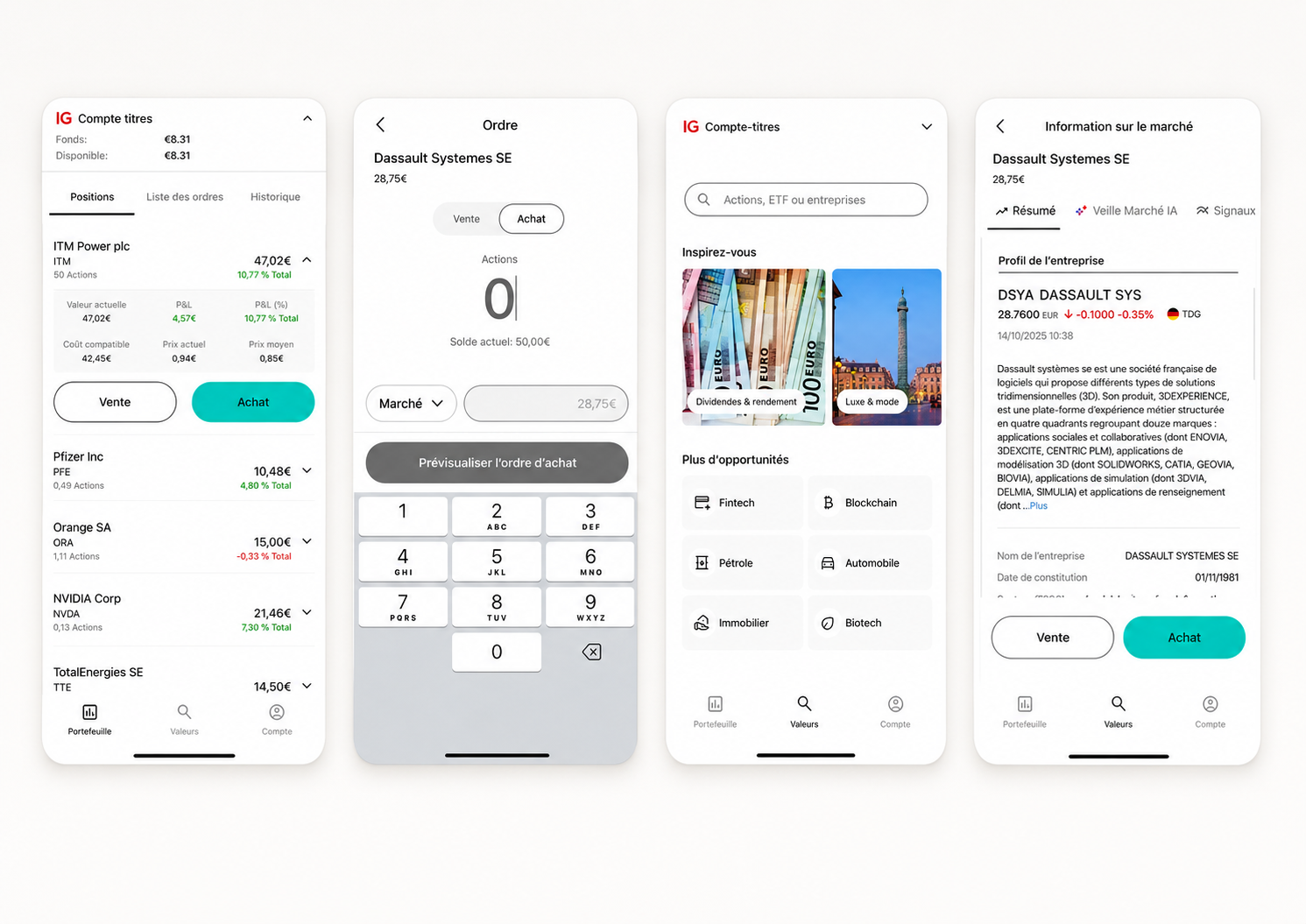
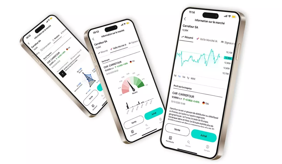
- Market Detail Page
- Order Placement
- Portfolio
- Statements
- Empty States
Designing for
the French market
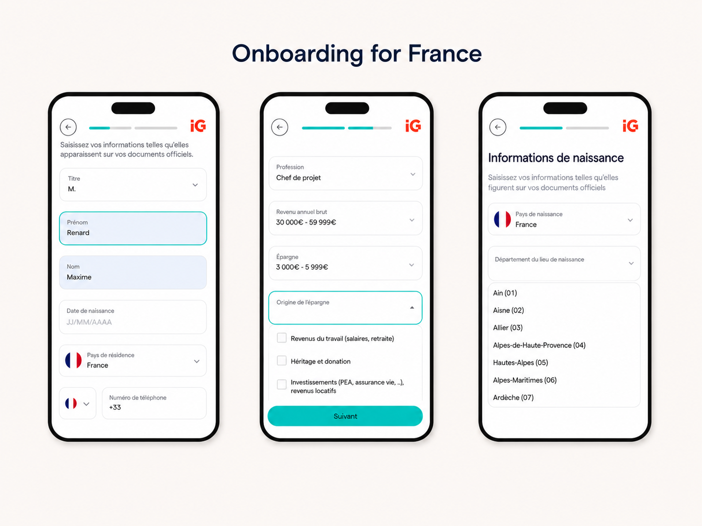
France was selected as the first launch market for IG Investments.
Designing for a specific national market meant more than translation. French users operate within a distinct regulatory environment governed by French financial authorities, with compliance requirements and disclosure obligations that differ materially from those in the UK. FCA-aligned patterns could not simply be transposed.
Research revealed that French investors frequently preferred interfaces built around familiar local financial language and demonstrated low tolerance for English terminology transposed into French. The risk of appearing as an imported product — rather than one designed for French users — was a real design concern that shaped decisions at every level.
Designing for confidence in this context required aligning usability, localisation, financial wording, regulatory disclosure and cultural expectations — not as sequential workstreams but as interdependent design constraints that had to be resolved simultaneously.
Designing for novice
and advanced investors
One of the most consequential challenges in the design process was serving two fundamentally different users inside a single product.
Novice investors arrived with limited financial knowledge, higher anxiety around decision-making and a strong need for guidance, reassurance and progressive disclosure that revealed complexity only when they were ready for it. Experienced investors arrived expecting the opposite — efficient workflows, immediate access to detailed financial information and the ability to complete investment actions without unnecessary friction.
The solution was not building two products. It was designing flexible information hierarchies and scalable interaction patterns that adapted to each user's behaviour — without degrading the experience for either audience.
- Guidance and reassurance
- Clarity over completeness
- Progressive disclosure
- Confidence at every step
- Efficient workflows
- Detailed financial information
- Fast order placement
- Advanced capabilities
One product. Two audiences. A single shared information hierarchy.
Navigating constraints
Every major design decision in Investments was shaped by at least one constraint. Understanding them early — and treating them as design inputs rather than blockers — was what made it possible to ship a coherent product.
Every screen, interaction and piece of financial copy had to pass through a compliance review process. Regulatory requirements shaped what could be shown, how it could be labelled and when disclosures were mandatory. Design had to accommodate these constraints from the earliest stages — not as a final gate, but as a constant presence in the design cycle.
France has its own financial regulatory framework, separate from the UK. Product flows, disclosures and terminology had to reflect French regulatory expectations — requiring close collaboration with legal and compliance stakeholders at every design decision point.
Legal review was a consistent part of the design cycle, not an exception. Financial instruments, risk warnings, investment terminology and order flows each carried legal implications that shaped design decisions in ways not always visible at the surface level.
Beyond translation, localisation required adapting financial terminology, date formats, legal copy and numeric conventions for French users. Research highlighted low tolerance for interfaces that felt like translated English products — localisation was a product quality requirement, not a final step.
The same product needed to serve users with no prior investment experience alongside those expecting advanced capabilities. This demanded deliberate decisions about information hierarchy, progressive disclosure and interaction patterns capable of scaling across a wide spectrum of investor confidence.
Financial information is inherently dense. Ensuring charts, data tables and order flows met accessibility standards meant designing inclusive information hierarchies from the beginning — not retrofitting them after core decisions were already made.
Investment workflows that feel manageable on desktop become genuinely complex on a small screen. Mobile-first constraints shaped how information was prioritised, how interactions were structured and how much could reasonably be asked of users within a single view.
Investment product decisions involved legal, compliance, risk, localisation, business and engineering stakeholders — often simultaneously. Maintaining design momentum across a high-volume review process required structured communication, clear documentation and the ability to iterate faster than the review cycle. The ability to explain design rationale clearly, not just present options, was as important as the design itself.
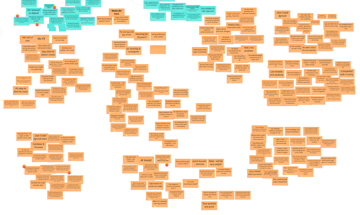
Synthesising research
into product decisions
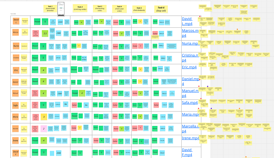
Dedicated UX researchers conducted user interviews and moderated usability sessions throughout the development of Investments.
My role was to collaborate closely with the research team — synthesising findings, identifying patterns and translating insights into product hypotheses, design concepts and testable prototypes. This was not a linear process. Research informed design, which returned to research. Prototypes were built to answer specific questions; usability sessions surfaced new ones and the design evolved in response.
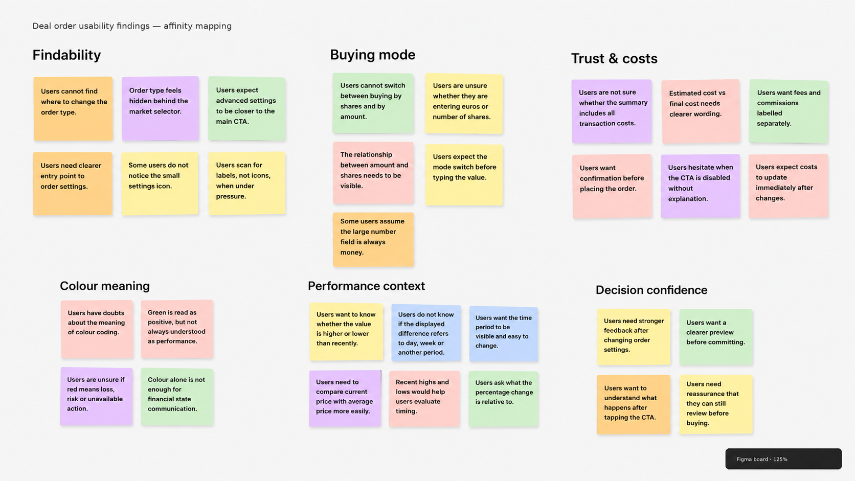
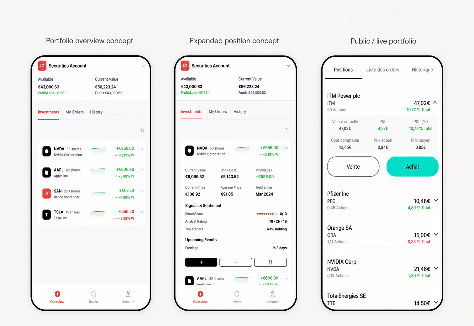
Key product decisions
Balancing information density with cognitive load
Investment products carry inherent complexity. Every financial instrument, risk indicator and order parameter is meaningful — but presenting everything at once undermines a user's ability to make decisions confidently. The challenge was determining what to surface immediately, what to progressively reveal and what to defer entirely — without losing users who needed depth.
Progressive disclosure for financial information
Rather than flattening the experience for less experienced investors, progressive disclosure allowed both audiences to be served within the same product. Essential information was always visible; detailed data and advanced capabilities were available to those who sought them. This approach maintained usability without reducing product depth.
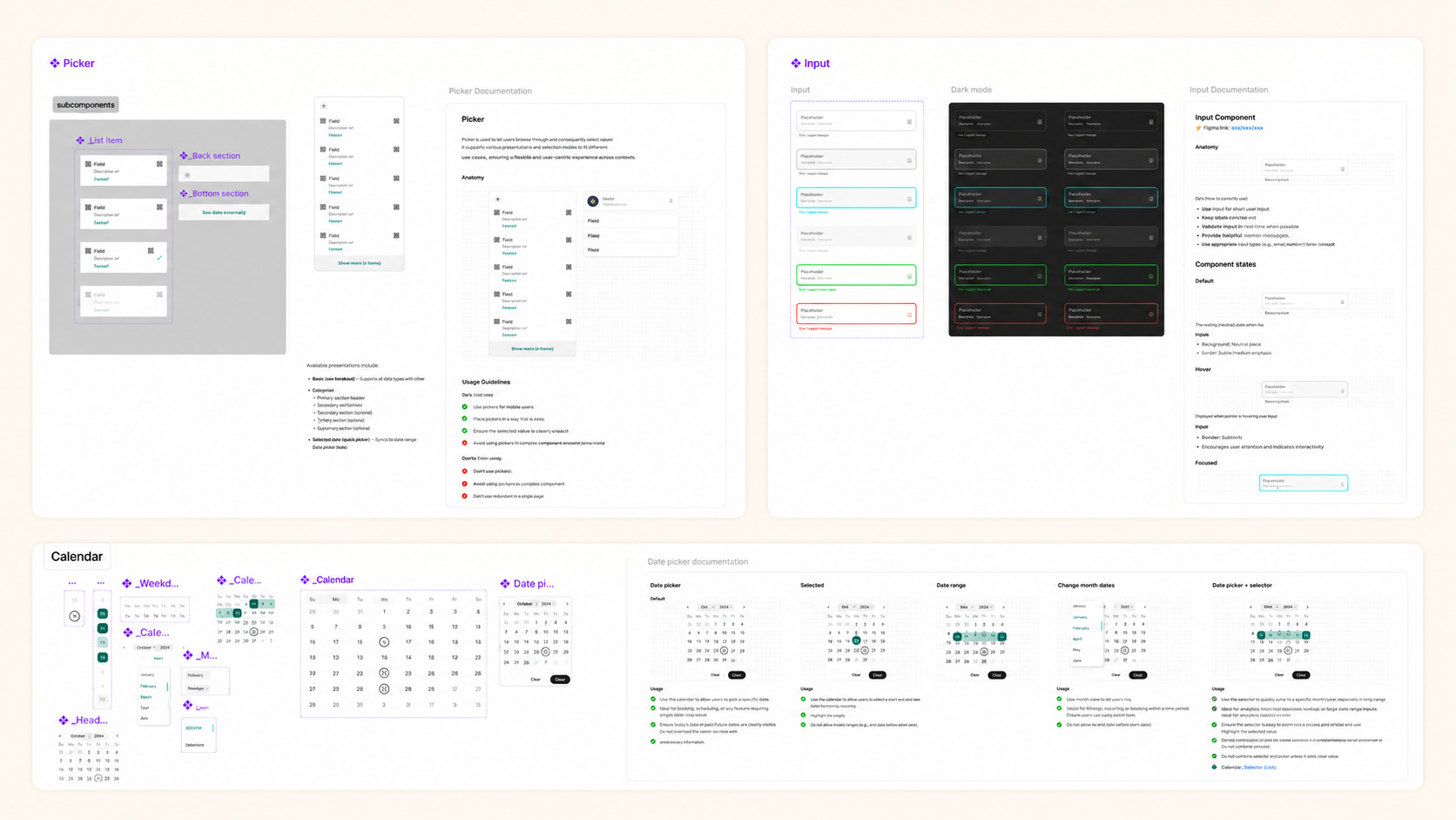
Designing reusable investment patterns
Investment journeys share structural similarities across different financial instruments — discovery, evaluation, order placement, portfolio management. Designing these as reusable patterns meant that new instruments could be introduced without rebuilding core interactions from scratch, while maintaining consistency across the product surface.
Building trust through consistency
In regulated financial products, inconsistency erodes trust faster than almost any other design failure. Consistent terminology, interaction patterns and visual hierarchy across all investment surfaces weren't cosmetic choices — they were fundamental to users feeling in control of real financial decisions.
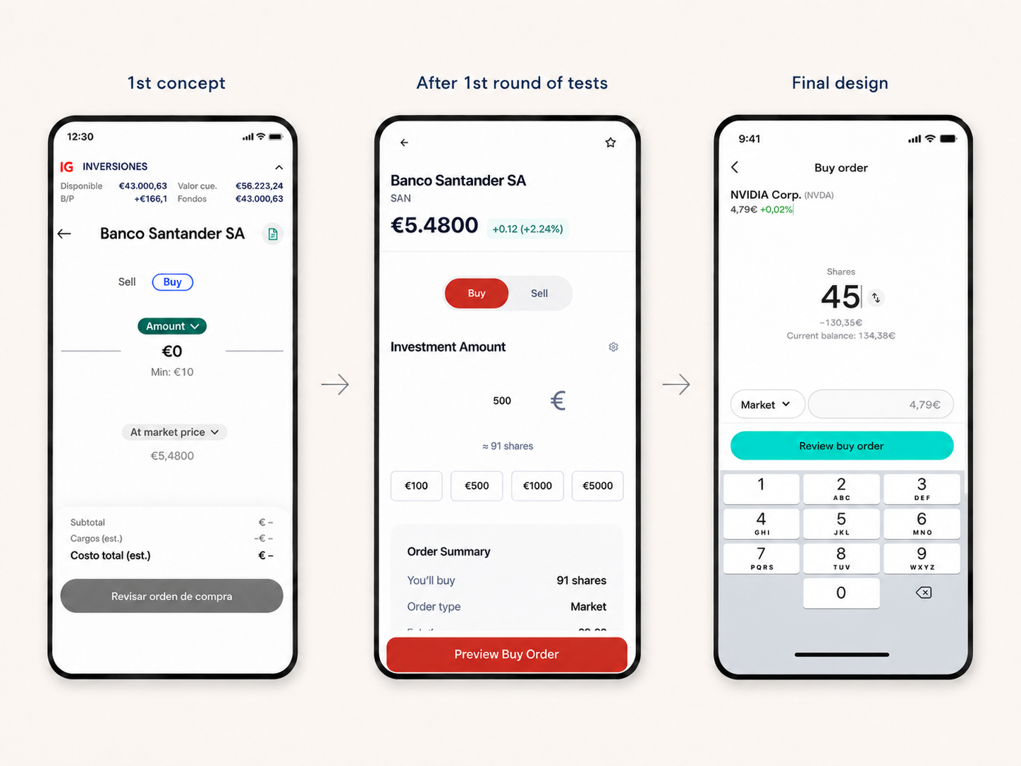
Final product
The product launched publicly in France across iOS and Android, bringing together a coherent investment experience across discovery, evaluation, order placement and portfolio management.
Public launch
Investments launched publicly through the IG mobile app and was accompanied by an official launch campaign across social media and marketing channels.
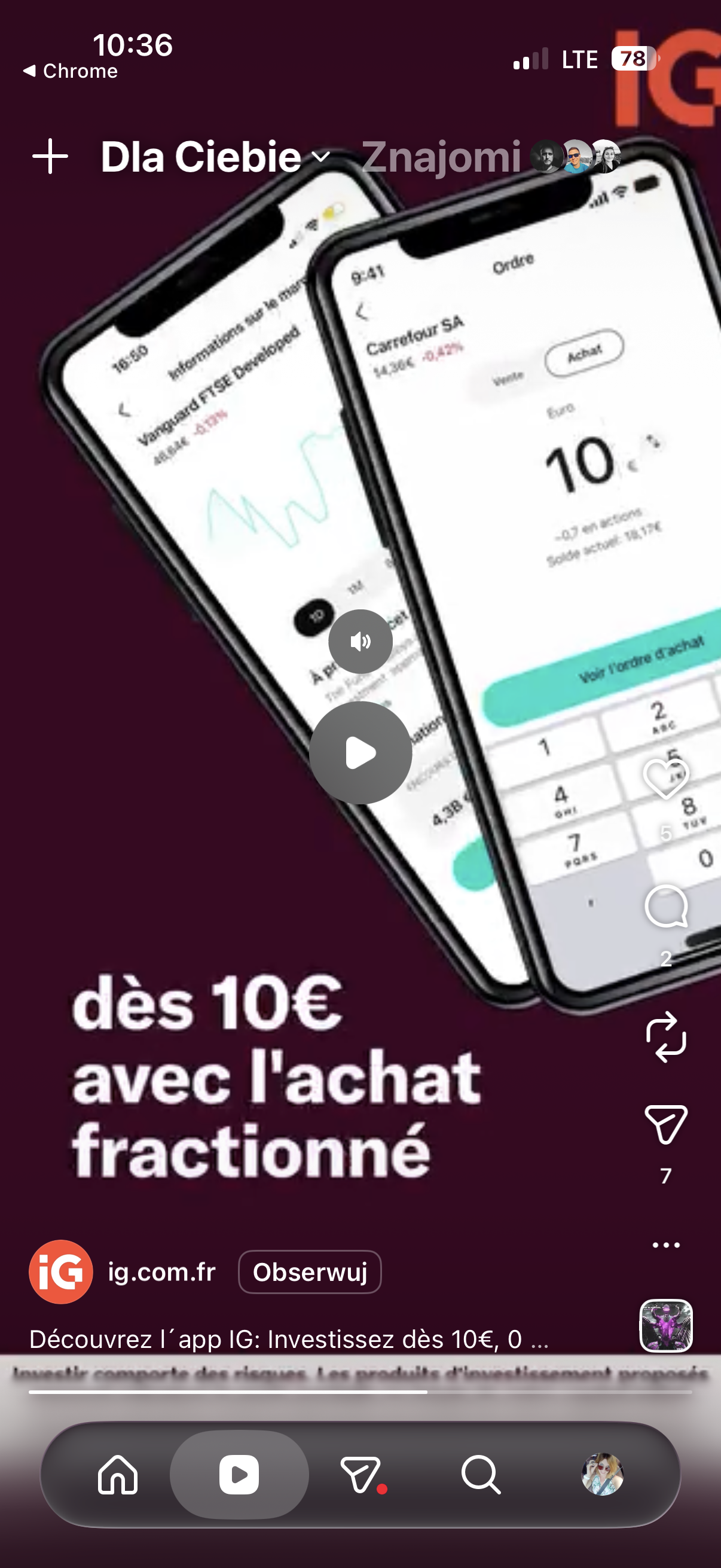
Campaign Visual
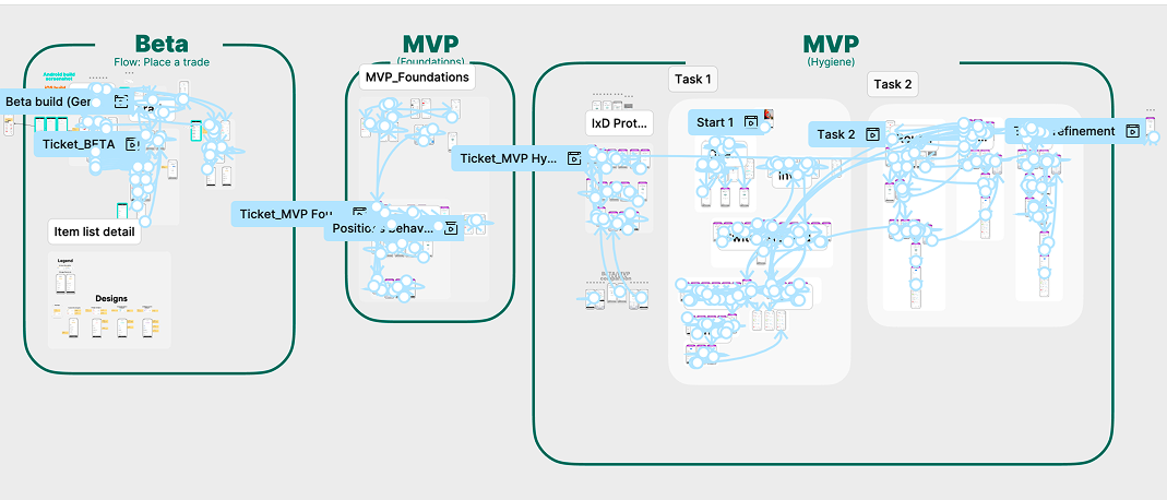
Scaling through systems
Investments relied on an existing design system, but evolving investment journeys occasionally required extending patterns, introducing reusable components and ensuring consistency across a growing product ecosystem.
Much of this work involved contributing to shared infrastructure rather than owning it independently — deciding when to reuse existing patterns, when to propose extensions and how to introduce new components without fragmenting the system.
Constraints make
better products
Working in fintech taught me that constraints are not obstacles to creativity.
Regulation, legal reviews, localisation requirements and business objectives often lead to stronger design decisions when treated as inputs rather than blockers. The tension between what is ideal and what is permissible is where much of the real design work happens.
Designing Investments strengthened my ability to navigate ambiguity — from building a product from scratch in a regulated environment to aligning multiple stakeholders around a shared vision for what the product should be.
The discipline of simplifying complexity without reducing users' confidence in what they're doing is something I continue to carry into every new product challenge.