MBX Flux
Designing precision control for complex magnetic systems
A desktop GUI designed for researchers, engineers, lab technicians and operators to configure, monitor and control magnetic field systems with clarity, precision and safety.
Designing for clarity in
a high-complexity environment
The main challenge was translating a highly technical control process into a clear, usable interface — one that could be understood and operated under pressure, with many parameters active at once.
Researchers, engineers and lab technicians working with magnetic field systems need precise, real-time control. They need to see live values, adjust parameters and respond to system states quickly — sometimes while the system is already running. There is little room for confusion.
The interface also had to function within a limited screen area. MBX Flux does not always run full-screen. The layout needed to be compact enough to share the display with other applications, while still giving users a complete picture of the system at a glance.
From console-based control
to a dedicated GUI
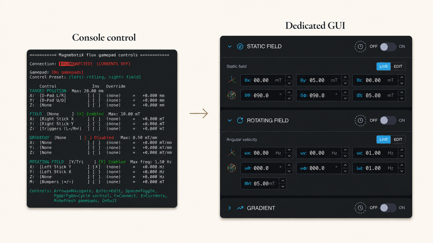
Before MBX Flux, the system was operated through a console. There was no dedicated graphical interface. Parameters were set through commands, system state was hard to read at a glance, and safety feedback was not structured in a way that supported real-time operation.
The new GUI brought everything into one view: key actions, live values, control modes, system status and safety feedback. Users could now see the full state of the system, make changes directly and respond to warnings — without switching between contexts or interpreting raw console output.
Designing this interface from scratch meant making decisions about information hierarchy, layout density and interaction patterns without an existing visual reference. The closest analogues were HMI and industrial control interfaces — which informed the decision to use a dark theme and compact, information-dense layout.
Structuring the interface
around operational priority
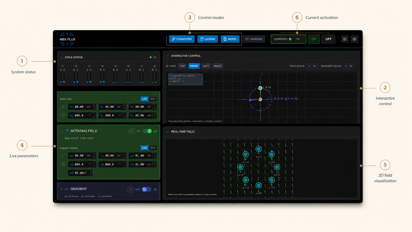
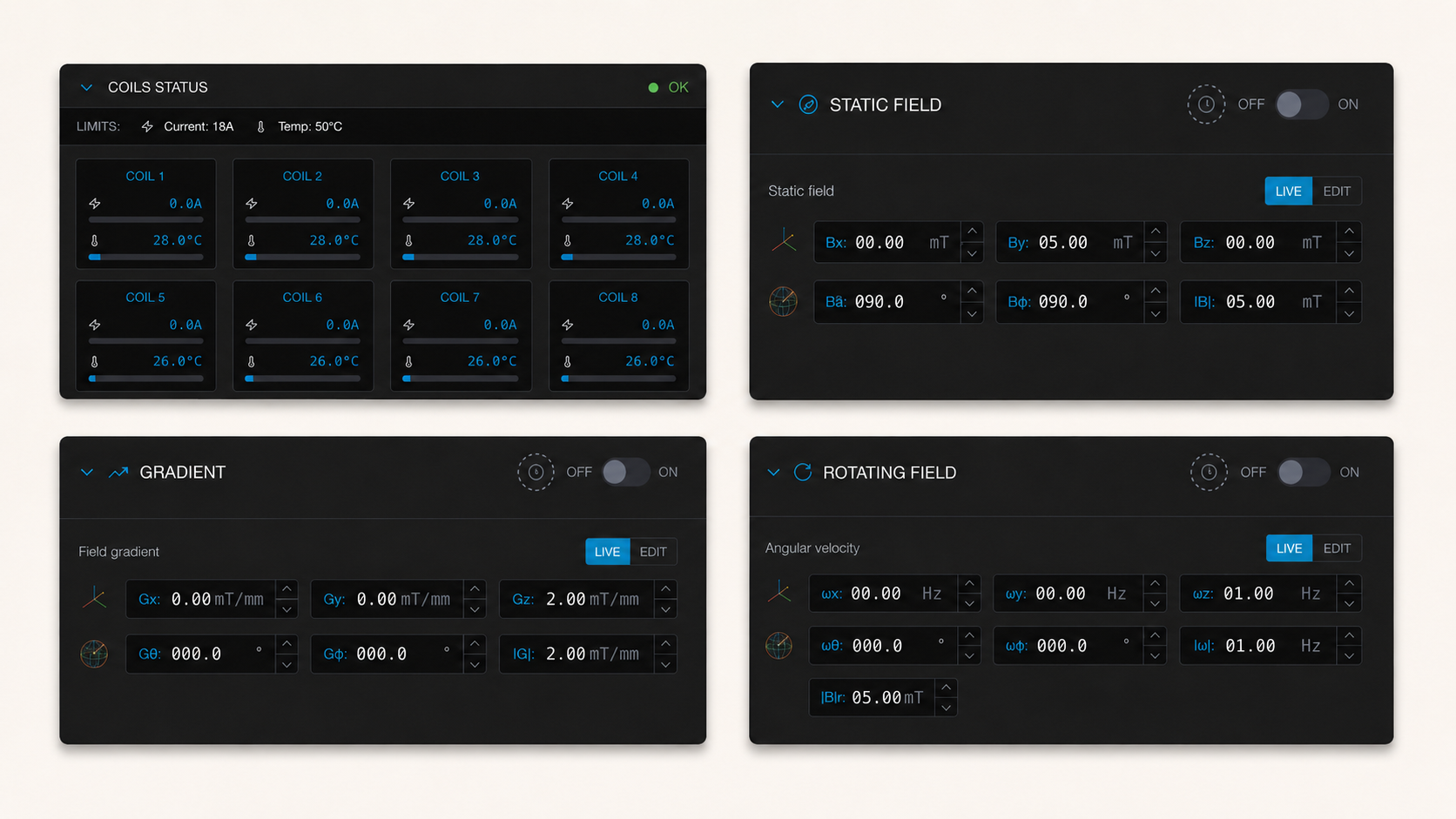
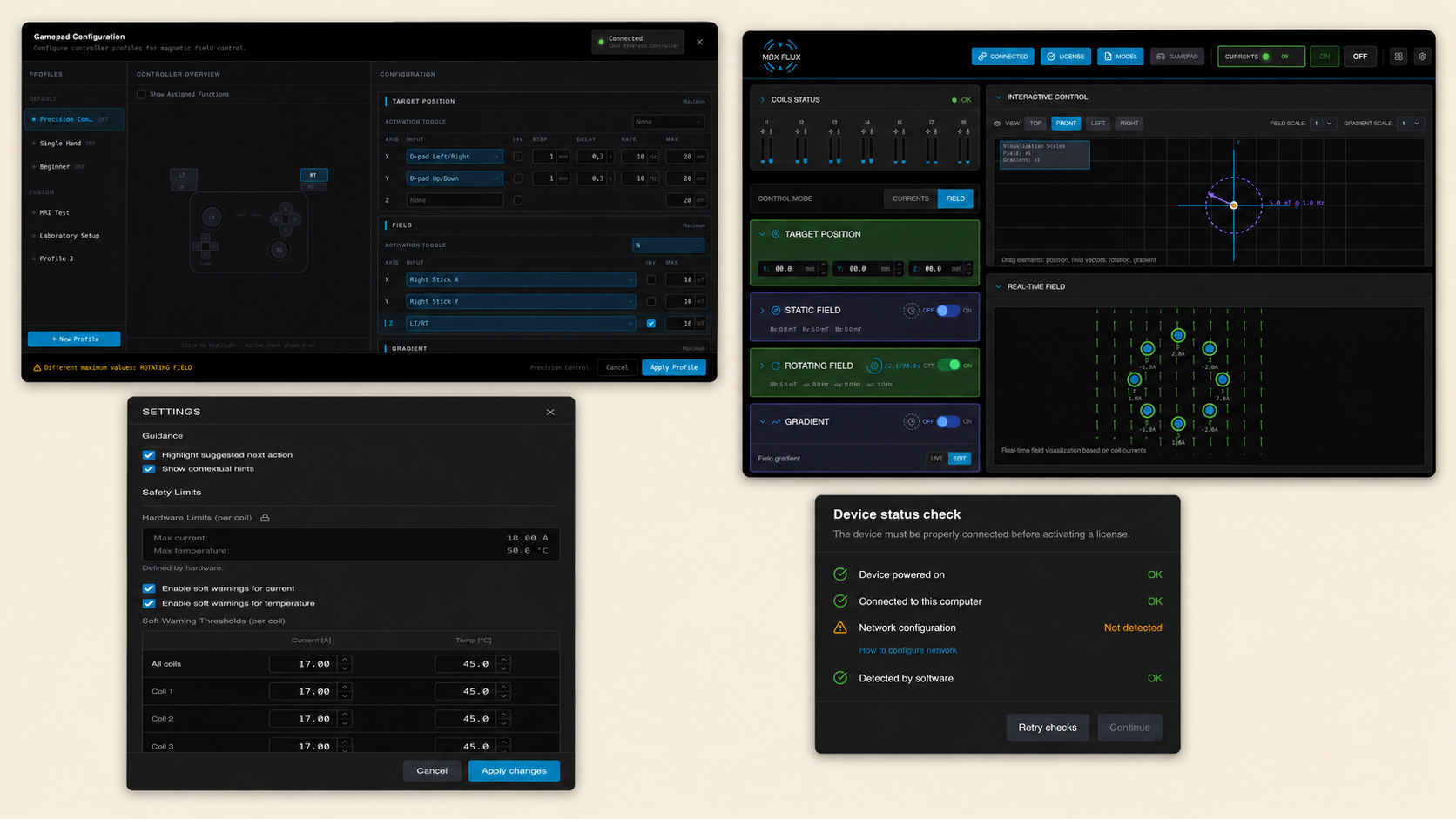
Rather than organising the layout by feature category, the interface is structured around what users need to act on first. System status and current state are immediately visible. Control modes, parameters and live values are grouped around the operations users perform most frequently.
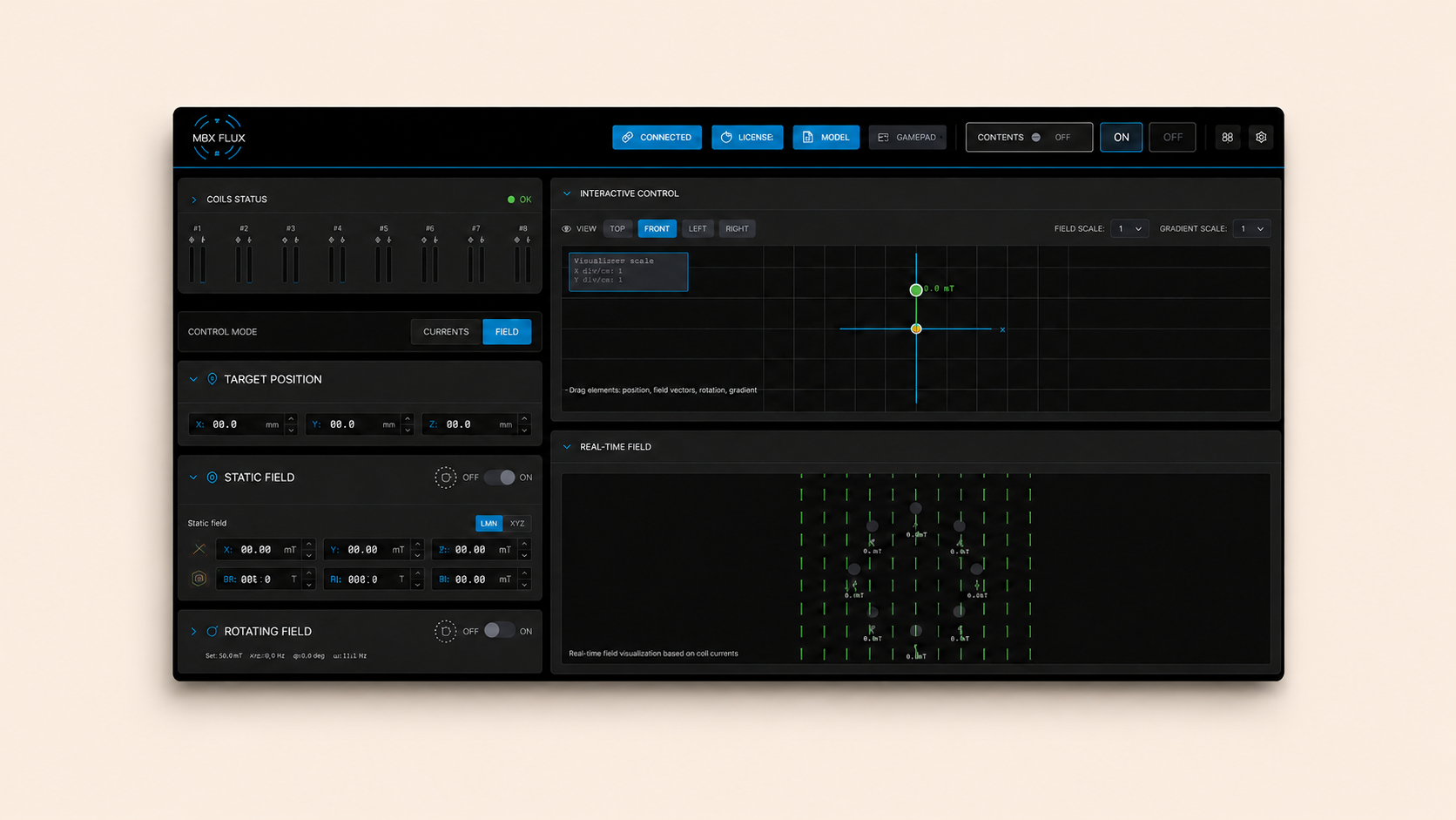
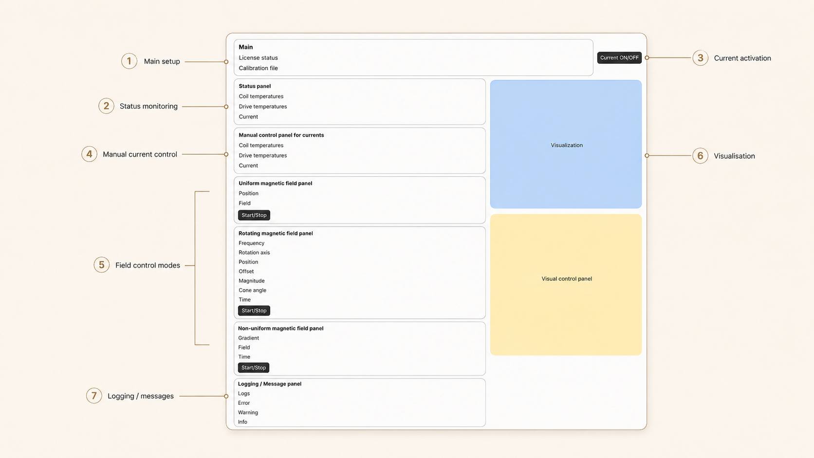
The layout supports a one-screen control model where nothing is hidden behind navigation. Everything required to operate the system — status, activation, field control, live readbacks and safety indicators — is present on a single view, arranged by operational priority rather than product logic.
This approach reflects how users actually work with the system: they orient quickly, make adjustments and monitor the result. The interface is designed to support that loop without adding friction.
Designing for
real-time control
Users adjust values, switch between control modes and monitor the system while it is running. Interactions need to be fast and predictable. In a technical environment where the system is actively operating, a slow or ambiguous interface response is not just inconvenient — it can be costly.
Compact parameter groups, numeric inputs and steppers allow precise value changes without excessive interface friction. Controls remain persistent and accessible regardless of the current system state. Status indicators and live values update in real time, keeping users informed without requiring them to navigate away from the primary control area.
Interaction patterns are consistent and predictable throughout. Users working quickly cannot afford to re-learn where things are or how they behave between sessions.
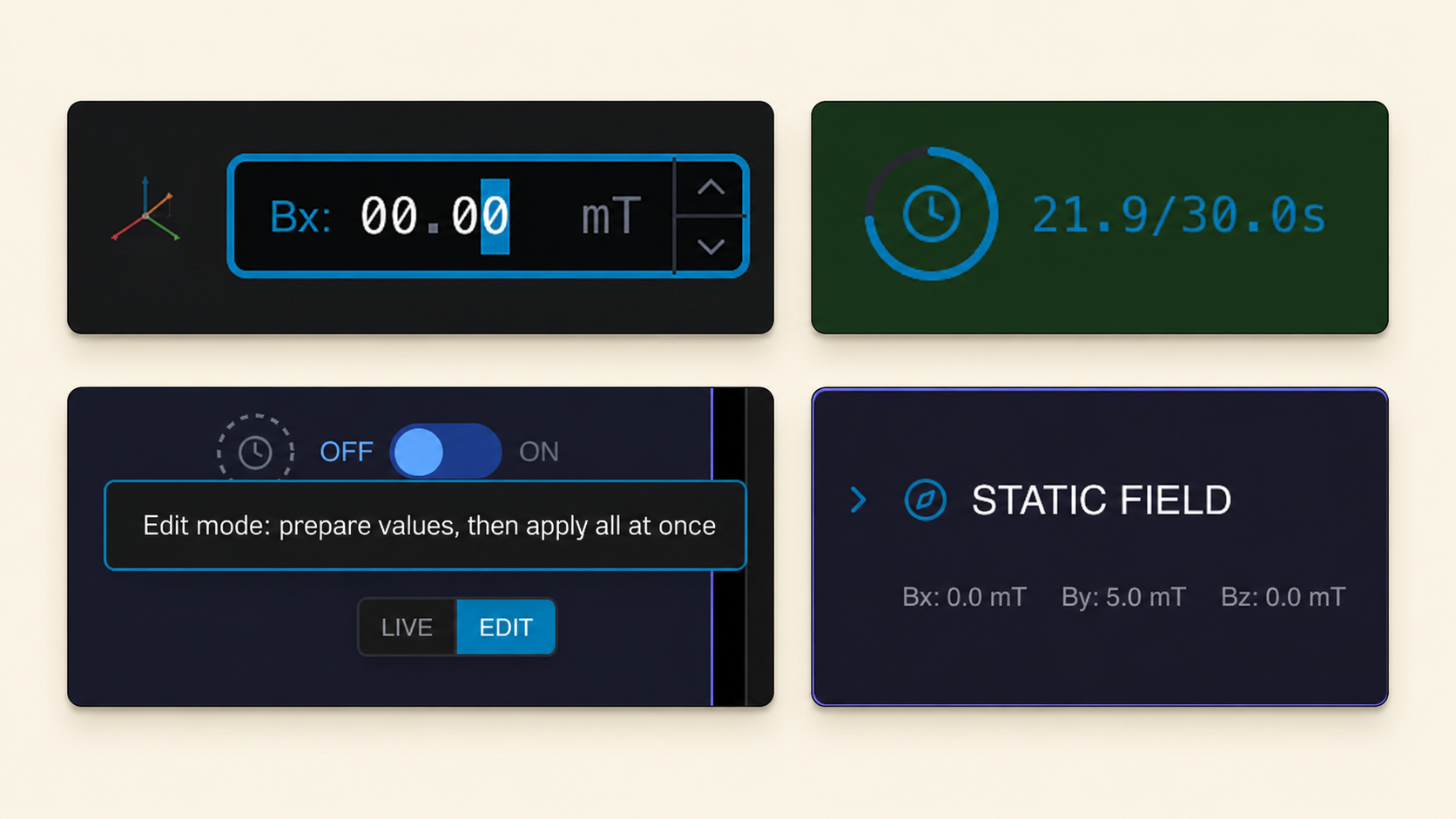
Control modes
The system supports several field control modes — including current-based control, field-based control, field and gradient control, and rotating field. Each mode changes which parameters are relevant and how the system behaves.
The goal was not to simplify the system by hiding this complexity, but to organise it so expert users could control it with more clarity, speed and safety.
Mode selection is visible and accessible from the primary control area. Parameter groups adapt to the selected mode, surfacing what is relevant without removing access to the full control set. Users working in one mode do not see irrelevant controls cluttering the interface — but switching is immediate when the workflow requires it.
Safety, limits
and system feedback
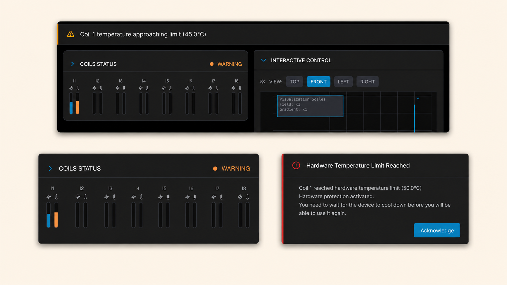
Safety is central to how MBX Flux communicates. The interface uses a structured feedback hierarchy to surface warnings and critical events at the right level of urgency — without interrupting the workflow when it is not necessary.
Warning states are shown as non-blocking banners. They inform the user without stopping the operation, allowing the user to assess the situation and respond appropriately while remaining in control of the system.
Critical states trigger a modal. This communicates an automatic current cut-off — a system action taken to prevent equipment damage. The modal requires explicit acknowledgement, because the event is not informational: the system has acted, and the user needs to understand why before continuing.
Live current and temperature readings, safety limit indicators and system state visibility are maintained throughout, giving users a continuous read on how the system is behaving.
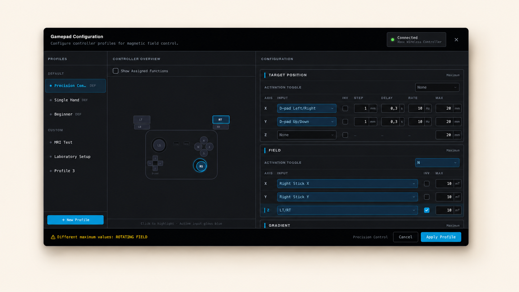
Gamepad mapping and
advanced interaction
Gamepad control is an optional advanced interaction mode — useful in specific operational contexts, but not required for every user or every session. Including it within the main control screen would have added complexity for users who do not need it.
The gamepad configuration flow is designed as a separate screen. Users who want to use controller input can select a connected gamepad, choose from presets, create custom mappings and test the configuration before applying it. The flow is self-contained and does not affect the primary interface for users who do not use it.
This approach keeps the main control view clean and focused, while making advanced interaction fully accessible to users who need it.
From requirements
to design decisions
Each design decision in MBX Flux traces back to a specific operational requirement or constraint. The mapping below shows how the structure of the interface was shaped by the context it needed to serve.
The system was previously controlled through a console with no graphical interface. A dedicated GUI was designed from scratch, bringing key actions, live values, control modes and safety feedback into a single view for the first time.
A one-screen control model keeps everything visible without navigation. Users monitor and adjust the system without switching context.
The interface does not always run full-screen. Compact, information-dense layout patterns keep the full control set accessible regardless of available screen space.
Persistent controls, numeric inputs and steppers allow precise value changes quickly and without modal interruption — even while the system is running.
Live status indicators, current and temperature readbacks and system state feedback remain continuously visible on the primary control screen.
Warning states are shown as non-blocking banners. Users are informed without being stopped — the operation continues, and the user decides how to respond.
Automatic current cut-off — triggered to prevent equipment damage — is communicated through a modal requiring explicit acknowledgement. The event demands attention, not a notification.
Gamepad configuration is a separate flow. Advanced interaction is fully accessible to users who need it, without adding complexity to the primary interface for those who do not.
A dark HMI-style interface with the client's Eurostile font reflects the technical context of the product and the conventions of the environment where it is used.
From AI-assisted prototype
to implementation-ready UI
Rather than creating a separate component library or design system from scratch, the interface was shaped directly in Figma Make. Make became the primary source of truth for the UI — allowing rapid iteration, real visual output and a tangible foundation for stakeholder review.
Key screens were extracted from Make for presentation, sign-off and annotation. The developer then used the Make-generated code as a strong starting point for the final UI implementation, which accelerated the build phase and reduced friction between design and development.
AI-assisted prototyping allowed me to explore interface directions faster, validate the structure with the stakeholder and provide a more tangible foundation for development. It also meant the handoff was not limited to static files — the generated code carried the design intent directly into the implementation.
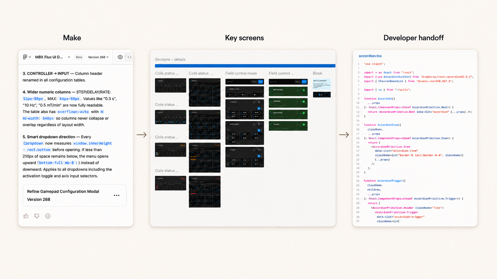
Selected final screens
Key screens from the final interface include the main one-screen control view, live field visualisation, field control mode switching, warning and critical state feedback, and the gamepad mapping configuration flow.
Precision, constraints
and the right tool for the job
MBX Flux was a project about designing for expert users, technical constraints and operational safety.
It strengthened my ability to translate complex requirements into structured interface decisions and to design workflows where clarity, precision and feedback hierarchy are as important as visual quality.
It also showed how AI-assisted tools can support real product work when used intentionally. Figma Make was not only a visual exploration tool, but also a practical bridge between design and development. Because the interface was shaped directly in Make, the generated code gave the developer a strong starting point and helped move the UI forward faster.
Designing from scratch — with no existing interface to reference — required clear thinking about what the system actually needed to communicate and what users needed to do. That constraint made for a more considered, focused result.