NapoleonCat
Redesigning core workflows in a social media management SaaS platform — helping teams publish content, manage conversations and collaborate across multiple social media channels.
Designing for clarity
in everyday social media work
Social media management is operational and context-heavy. The people who use NapoleonCat are not casual users — they are teams managing multiple social media profiles across platforms, often simultaneously, as part of their daily work.
Their workflows involve creating content, adapting it to different platforms, collaborating with teammates on approvals, responding to comments and messages, and keeping track of what has already been handled. This is repetitive, structured and demanding work — and the tools that support it need to reflect that reality.
The redesign was not about refreshing the visual aesthetic. It was about making complex daily workflows clearer, faster and easier to act on — without removing the advanced functionality that experienced users depend on.
Supporting teams managing
multiple social channels
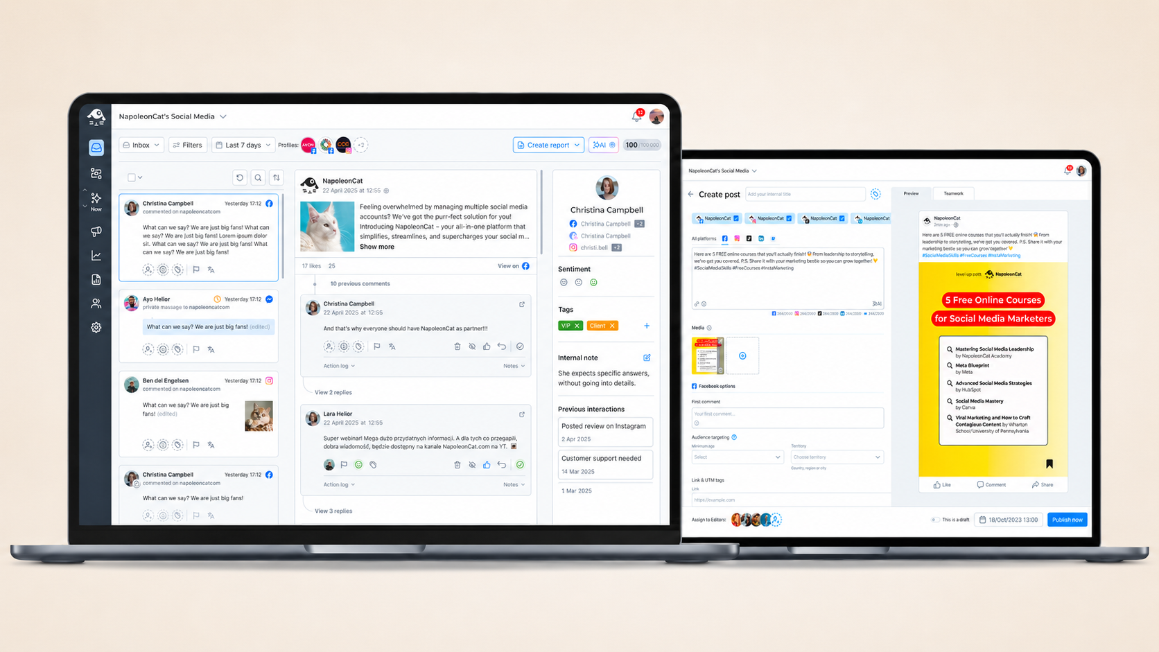
NapoleonCat is used by social media agencies, in-house marketing teams and power users managing multiple profiles across platforms such as Facebook, Instagram, LinkedIn and Twitter. On any given day, their work involves switching between planning content, preparing platform-specific variants, reviewing and approving posts, and replying to incoming comments and messages.
Both focus areas in this case study — Publisher and Inbox — sit at the centre of that daily workflow. They are the parts of the product users return to most frequently, where the quality of the interface directly affects how much effort it takes to do routine work well.
- Creating content across platforms
- Platform-specific content variants
- Post previews and scheduling
- Approval and collaboration
- Managing incoming comments and messages
- Post and conversation thread context
- Conversation assignment and status
- Reducing external context switching
Research-led
workflow redesign
Both projects followed the same research-led process, adapted to the specific challenges of each focus area.
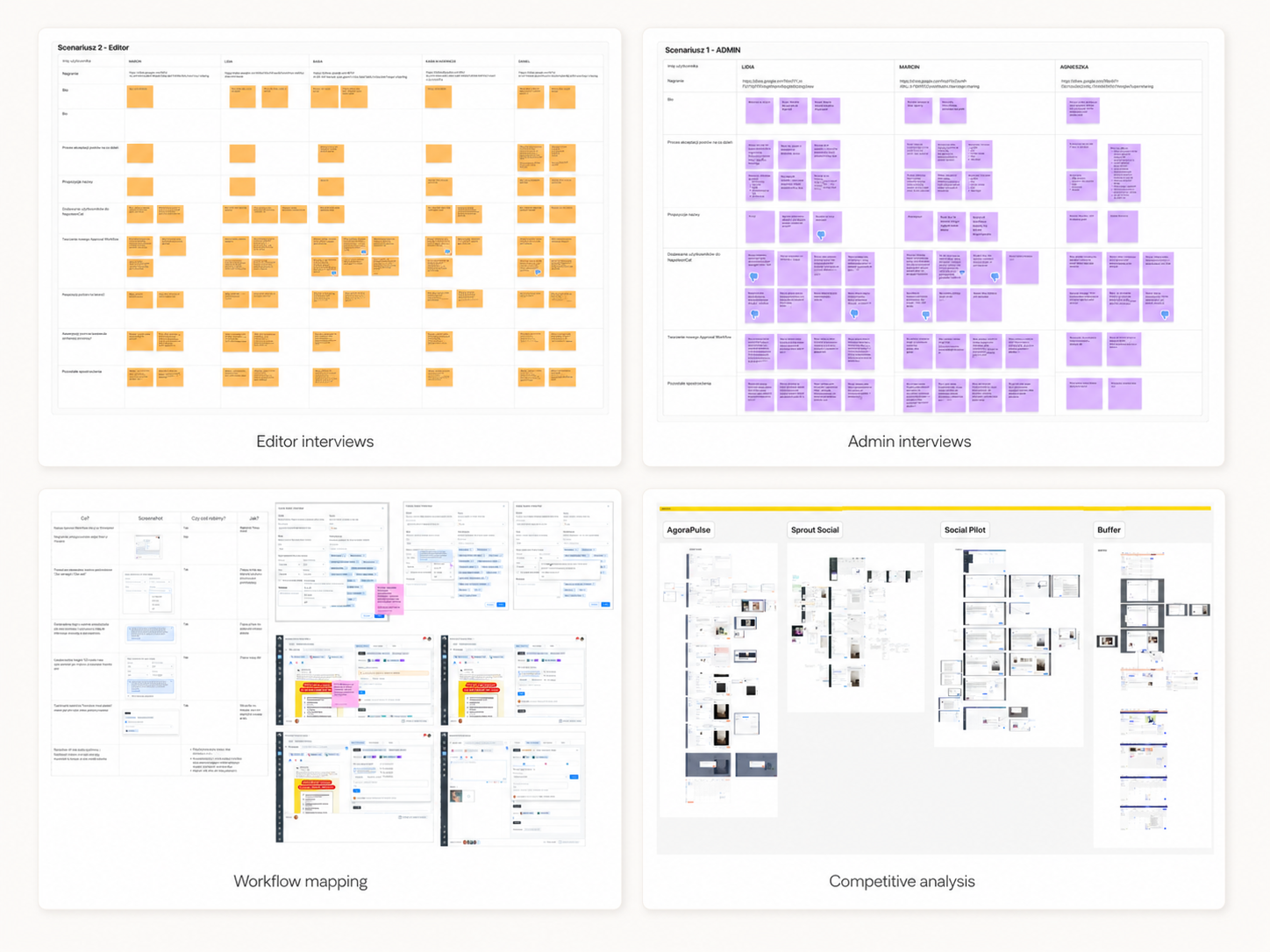
The process began with research interviews — around eight to ten conversations per project with social media agencies, NapoleonCat clients and power users. These interviews were structured around understanding how users approached their daily work, where the existing interface created friction and what decisions were hardest to make inside the product.
Interview findings fed directly into a UX audit of the existing interface, mapping current workflows, identifying structural problems and distinguishing genuine usability issues from surface-level visual inconsistencies. This informed the redesign approach for each area.
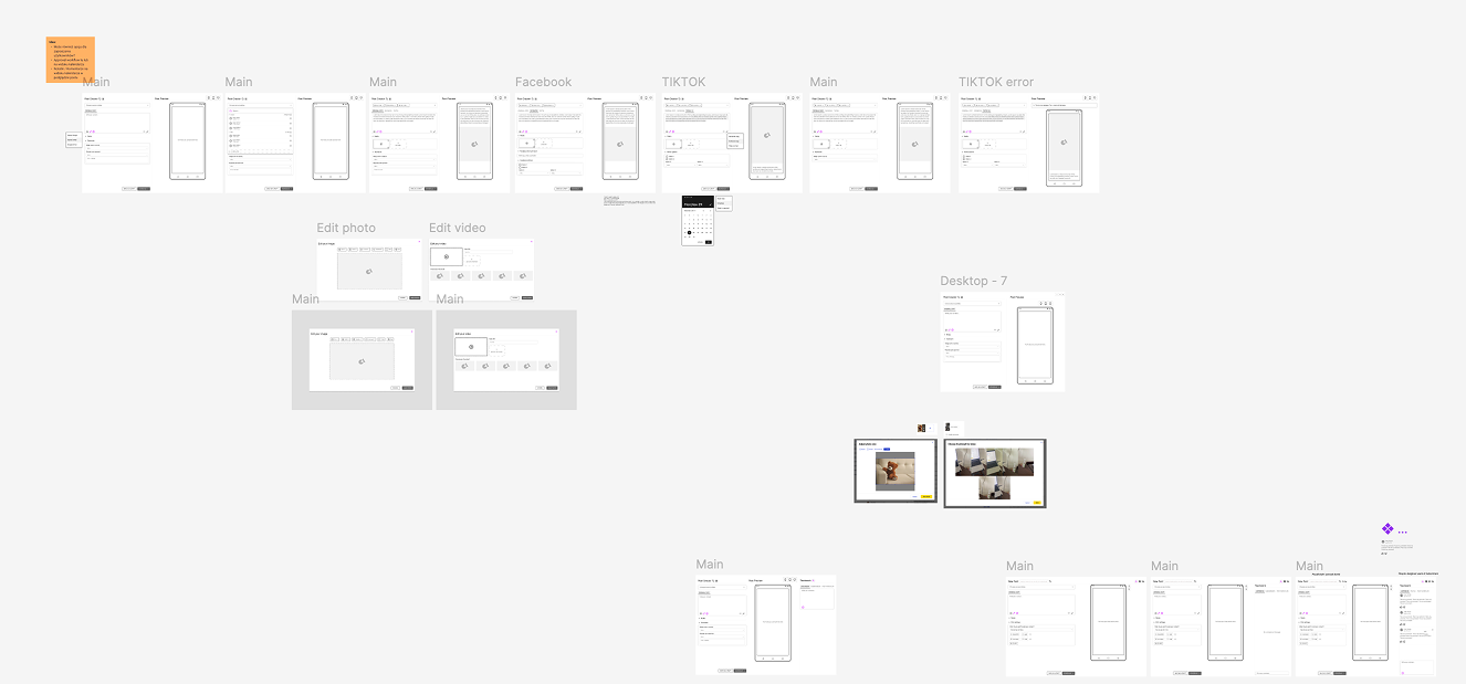
Redesigned workflows were validated through usability testing of clickable prototypes, confirming whether the proposed direction solved the problems identified in research and surfacing any remaining issues before handoff. Findings from testing informed final iterations before development alignment.
- Research interviews (8–10 per project)
- UX audit of existing interface
- Workflow mapping and pain point analysis
- Redesign of flows and interface structure
- Clickable prototypes
- Usability testing
- Iteration and refinement
- Stakeholder and development alignment
Redesigning the
publishing workflow
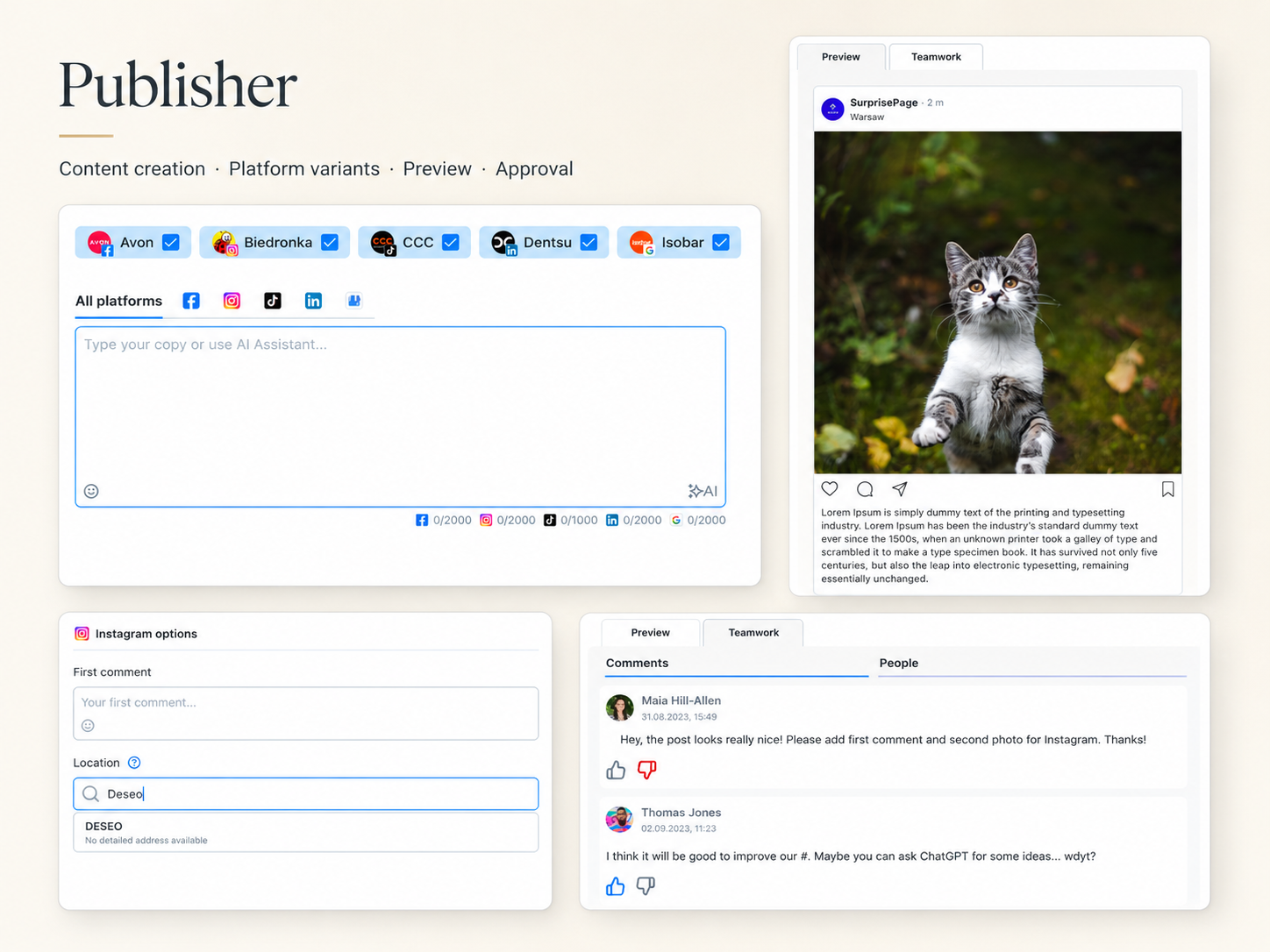
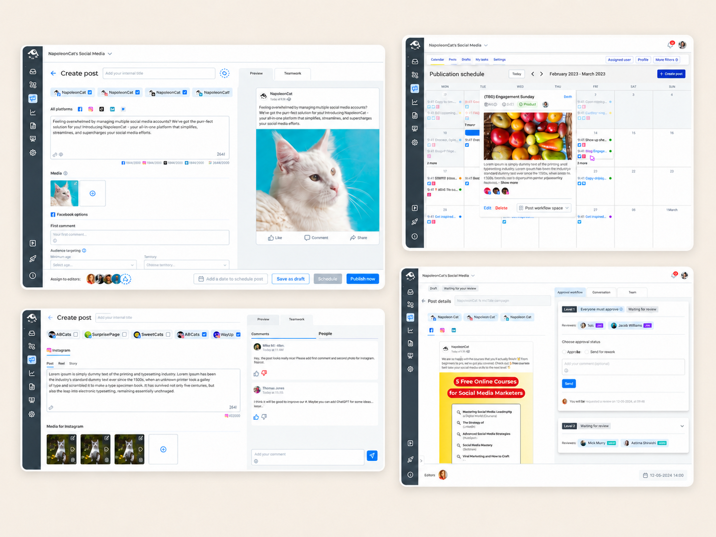
Publisher is where users create, configure and schedule content before it goes out. For teams managing multiple social media profiles, a single publishing session might involve creating content for Facebook, Instagram and LinkedIn simultaneously — each with its own character limit, media requirements, preview format and scheduling logic.
The existing Publisher interface had accumulated complexity over time. Decisions about content, settings, variants and scheduling were scattered across the interface without a clear hierarchy. Users frequently lost track of which platform they were editing, what had been configured and what still needed attention before a post could go live.
The redesign focused on creating a clearer, more predictable publishing workflow. Content and settings were separated more explicitly. Platform-specific variants were given clearer structure and visual distinction, so users could move between them without losing context. Post previews were integrated in a way that supported review before publishing rather than requiring users to check externally.
Approval and collaboration features were restructured to make the publishing state — draft, pending review, approved, scheduled — more visible throughout the workflow, reducing the cognitive overhead of coordinating publishing decisions across a team.
Improving Inbox with
conversation context
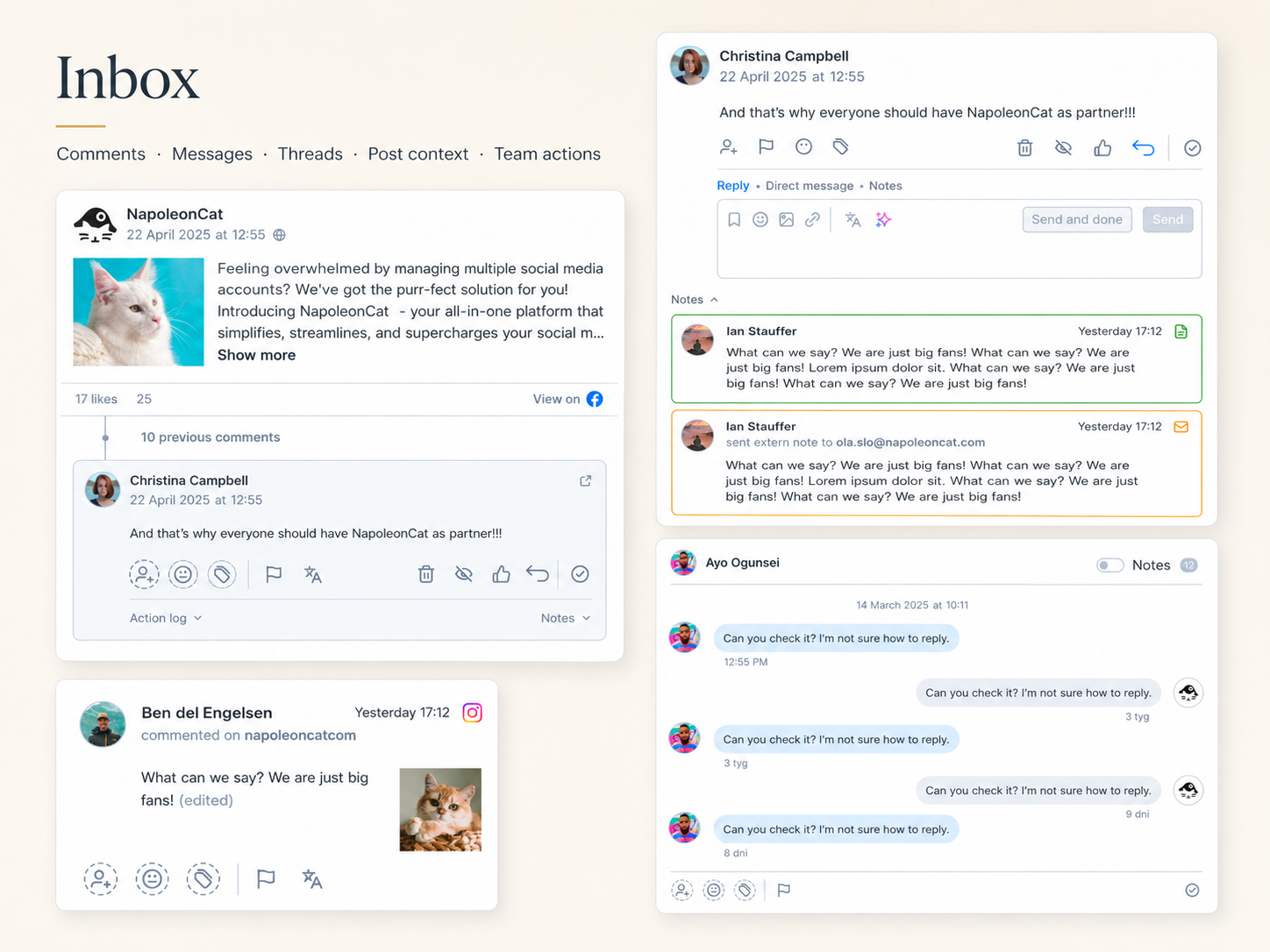
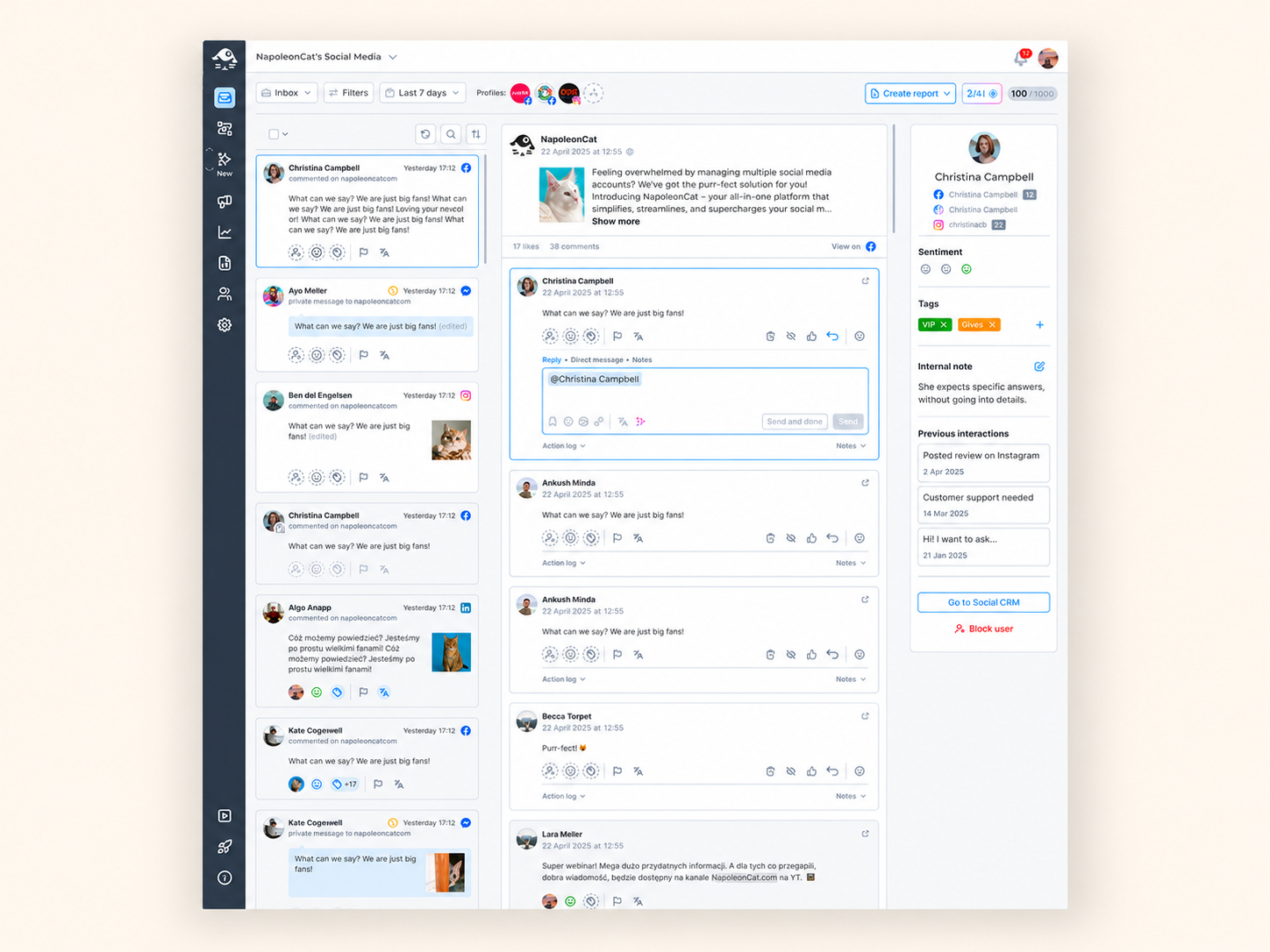
Inbox is where teams handle incoming comments and messages from across their connected social media profiles. The problem was not the volume of interactions — it was the absence of context.
Each incoming interaction appeared as a separate item with no connection to the post it came from or the thread it belonged to. To understand what a comment was actually about, users frequently had to open the original post on the social media platform — leaving NapoleonCat entirely to gather context they should have had inside the tool.
Together with another product designer, we proposed a layout that brought more context directly into the working area. The redesigned Inbox showed the source post alongside the interaction, making the content of the original post visible without leaving the tool. Threaded conversations were presented as conversations rather than isolated items, following interaction patterns already established in competing tools.
The goal was not to replicate the experience of a social media platform, but to give users enough context to respond accurately and efficiently without switching away from NapoleonCat. Usability testing confirmed that the added context reduced the need to open external sources and helped users respond with more confidence.
Navigating SaaS
product constraints
Both projects operated within a set of constraints that shaped what could be changed, how quickly and to what degree. Treating these as design inputs — rather than obstacles — was essential to making progress in a mature, interconnected product.
Publisher and Inbox were connected to older modules within the NapoleonCat platform. Parts of the interface and underlying architecture could not simply be rebuilt from scratch. Design decisions had to account for what existed, prioritise changes that were feasible within current constraints and avoid introducing technical debt that would slow future work.
Each social media platform — Facebook, Instagram, LinkedIn, Twitter and others — has its own content rules, character limits, media formats and scheduling logic. Publisher needed to support all of them within a single interface, without making the experience feel fractured or overwhelming by default.
What can be done inside a social media management tool is bounded by what the platform APIs allow. Some improvements — richer preview data, additional conversation context — were constrained by what could be retrieved and displayed within API permissions.
NapoleonCat's most engaged users rely on advanced functionality that simpler tools do not offer. Redesigning Publisher and Inbox meant preserving those capabilities while making the interface more approachable for less frequent users — without creating a two-tier experience that felt inconsistent.
Publisher and Inbox connect to other parts of the NapoleonCat product — analytics, team management, profile settings — and changes to one area could have knock-on effects elsewhere. Scope needed to be carefully defined to avoid unintended disruption to connected workflows.
From research findings
to design decisions
Clearer hierarchy in the publishing workflow
Research showed that users lost track of context when content, settings and platform variants competed for attention without a clear hierarchy. The redesign separated these concerns more explicitly — making it easier to understand what was being edited, for which platform and what still needed to be done before publishing.
Structured support for platform-specific variants
Creating content for multiple platforms in a single flow required a way to distinguish shared content from platform-specific versions without creating a fragmented experience. The redesign gave variants clearer structure and visual separation, reducing the risk of publishing the wrong version or missing platform-specific requirements.
Context inside Inbox, not outside it
The most significant insight from Inbox research was that users regularly left the product to gather context available only on the source social media platform. The redesigned layout brought post context and conversation threads directly into the working area — removing the most common reason to switch away.
Design decisions grounded in usability testing
Usability testing of prototypes confirmed that the proposed directions improved task completion and reduced confusion in both areas. It also surfaced assumptions that needed to be revisited — keeping the process honest and grounding final decisions in observed behaviour rather than design intuition alone.
Scaling through systems
Redesigning Publisher and Inbox was closely connected to building a more consistent product language across NapoleonCat.
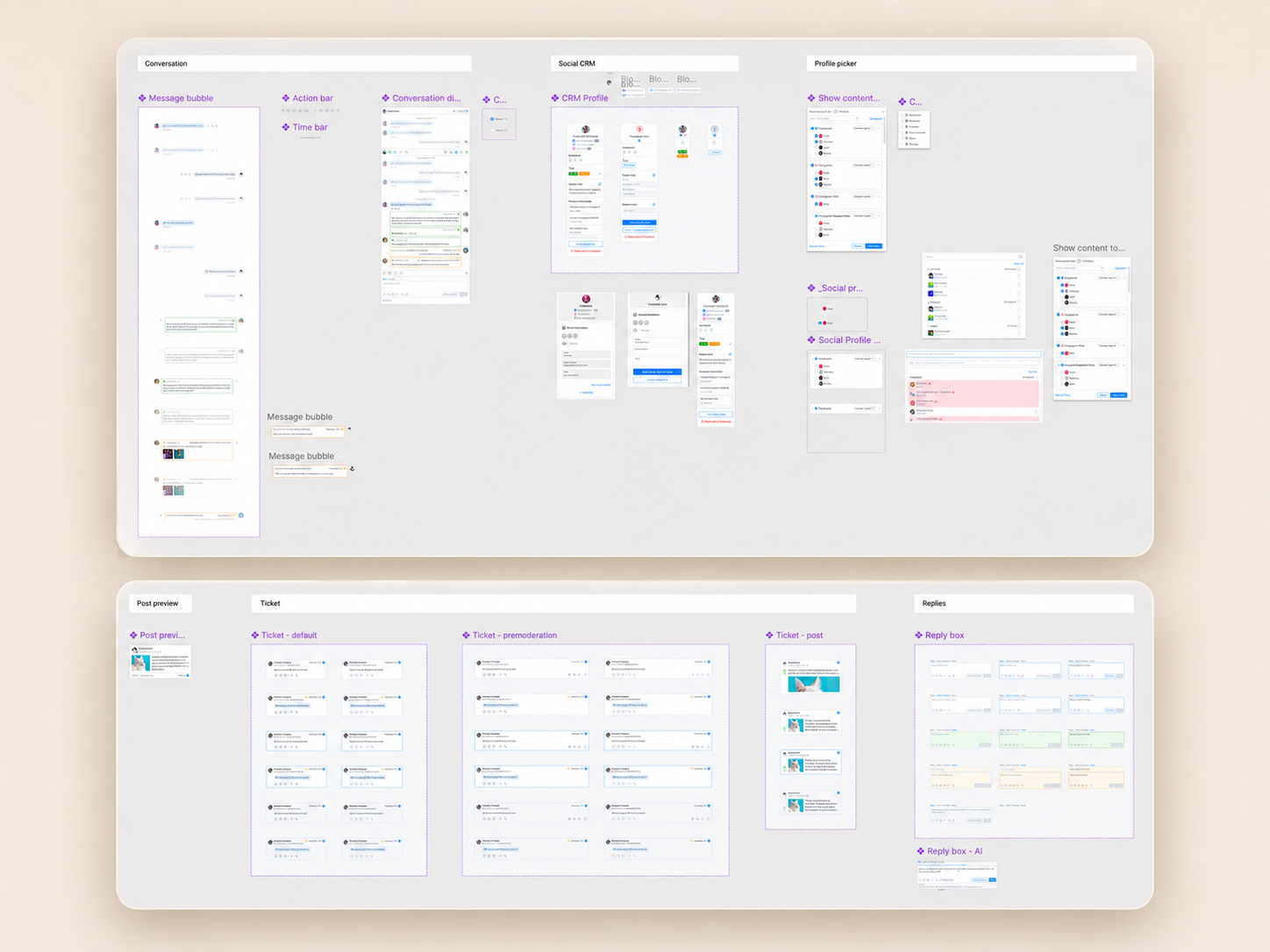
Together with another designer, I worked on creating and extending the design system to support recurring patterns, reduce visual inconsistencies and make future product work easier to scale. This included defining reusable components, improving interface hierarchy and aligning interaction patterns across different parts of the platform.
The goal was not only to make individual screens look more modern, but to create a stronger foundation for a mature SaaS product — one that could support complex workflows, multiple user roles and platform-specific requirements without becoming visually fragmented.
Much of this work required balancing consistency with flexibility: deciding where shared patterns should be reused, where they needed to evolve and how to support advanced functionality without making the interface feel overloaded.
Designing clarity
for complex team workflows
Working on NapoleonCat taught me that in mature SaaS products, complexity rarely comes from a single feature.
It comes from the way many workflows, roles, platforms and technical dependencies overlap in everyday use. Both Publisher and Inbox required more than a visual refresh. They needed clearer structure, stronger context and design decisions grounded in how teams actually work — creating content for multiple platforms, reviewing variants, managing approvals and responding to conversations without losing the bigger picture.
The project strengthened my ability to design within real product constraints: legacy architecture, API limitations, existing modules and advanced workflows used by power users. Instead of treating those constraints as blockers, we used them to make more focused decisions about what should change, what should stay familiar and where the product needed a stronger system behind it.
Designing NapoleonCat reinforced my belief that good SaaS design is not about simplifying everything. It is about making complexity manageable, predictable and easier to act on.